Eugene Symphony Accessibility Audit
My Role: UX Researcher, self-lead project
Timeline: March - July 2024
I earned my Google UX Design Professional Certificate in 2023 and wanted to use the knowledge I gained in that course to help the Symphony ensure the user experience of the website is accessible for their broad audience.
The Symphony’s tagline “enriching lives through the power of music” was my inspiration for this report.
About Accessibility
An accessibility audit covers many aspects of a site. This report uses the previous website as a guide to highlight areas of improvement for accessibility and focuses on the aspects that can be applied to the new site, and to future online endeavors.
Goal:
An understanding of accessibility and how best to approach the Symphony’s website and future Web endeavors
What is accessibility?
Accessibility means that products, information, and environments are usable for as many people as possible.
What influences the need for accessibility?
The need for accessibility is not binary
Permanent
Blindness
Deafness
Loss of limb(s)
Cerebral Palsy
Temporary
Eye dilation
Illness (common cold)
Broken limb(s)
Ataxia (under the influence)
Situational
Lighting (glare from the sun)
A loud setting (concert or restaurant)
Full hands
Under stress, duress, or heightened anxiety
Accessibility benefits everyone!
You benefit from assistive devices and technology even if you’re not the intended audience
Sidewalk curb cutouts
Typewriters (and eventually keyboards)
Electric toothbrushes
Speech-to-text/Voice recognition apps
Bendy straws
Audiobooks
Why does accessibility matter on the web?
Offerings should be able to be utilized by anyone, anywhere, at any time
Legal ramifications
WHO reports 1.3 billion people experience significant disability, that’s 1 in 6 of us
Temporary disabilities
Broken bones
Injured eyes/ears
Etc.
Accessibility on the web
Encompasses all disabilities that affect access to the web
Auditory
Cognitive
Also benefits people without disabilities
People using mobile phones, smart watches, smart TVs and other devices with smaller screens, different input methods, etc.
Older people with changing abilities due to aging (w3.org)
Web accessibility means that websites, tools, and technologies are designed and developed so that people with disabilities can use them.
More specifically, people can:
Perceive, navigate, and interact with the Web
Contribute to the Web
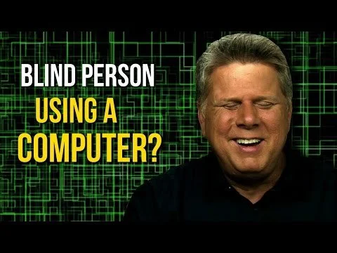
Assistive tech in use - Tommy Edison
I wanted to showcase a real life case of an individual using assistive technology; luckily, Tommy Edison, a fully blind content creator, made this short informative video that I’d like to share with you!
Accessibility Findings
This report’s focus
A typical accessibility audit covers five flows, which captures 80% of the issues with a product.
For this limited report, I will be focusing on the three I found were most imperative, and highest trafficked.
Homepage
Events Page
Concert Page
A note about navigation
Navigation is a critical element for users to move through a site easily. If an individual is not able to navigate a site, they will not use it.
Effective website navigation can:
Simplify comprehension of your site’s user path and content
Gain trust of users with a credible presentation of products and services
Enhance your company’s overall user experience (userway.org)
Screen reader navigation
According to a 2024 WebAIM survey, 87.6% of 1,214 people with disabilities reported using a screen reader. It is an important aspect to review in an accessibility audit.
This report’s focus, continued
I chose these top level issues to focus on because they are what a majority of users of the Eugene Symphony website will notice first and because they impact a variety of users and provide clear examples for improvement that can be leveraged on the new website.
Color
Alt Text
Alt text needs to describe the image as concisely as possible. As a rule of thumb: avoid writing text alternatives longer than 100 characters.
Keyboard Navigation
Moving through a website using only the keyboard
Heuristics
A method of identifying design problems in a user interface
User Control and Freedom, and Consistency and Standards are the main rules that were focused on in this report, though I touched on all of them when going through the site pages
Color
According to the Web Content Accessibility Guidelines (WCAG), web pages must have a minimum color contrast ratio of 4.5:1 for normal text and 3:1 for larger text.
Not meeting these ratios really just means that your site or app will be difficult to read, which is something we want to avoid.
Color: Homepage
Though all of the following screenshots are from the homepage, this section of the site showcased all of the different accessibility issues and successes in just a few scrolls. The main pitfall throughout the site was the use of the brand’s light blue color. If the time and resources were available I could dive into how to better utilize this calm color, but for now we’ll just talk about why the uses weren’t working and some possible simple solutions that don’t involve an entire site overhaul.
The blue on white and white on blue heavily featured here has a contrast ratio of 3:14:1 meaning it only passes with large, bold text
Color: Events Page
Color: Concert Page
Both the white on cream and blue on white are heavy eye strains, on most screens the white button disappears completely into the cream.
Alt Text
Alt text (alternative text) describes an image on a page. Alt text helps visually impaired people understand what the image shows, helps search engine bots understand image contents, and appears on a page when the image fails to load. (semrush.com)
Just like images; when you hover over an icon, the web page should tell you what that icon is.
*A useful tool for using alt text is to create a naming convention for all images and icons to keep branding and voice cohesive
An example of alt text on an icon
Here you can see that the Facebook icon is highlighted, but there is no alt text. Looking into the code we can see that there is no alt text set!
Keyboard Navigation
Keyboard navigation is a method of controlling a computer interface through the use of keyboard keys, bypassing the need for a mouse or touchpad. This approach enables users to navigate through menus, select buttons, interact with various web elements, and input data within text fields, relying entirely on keystrokes. (accessibe.com)
Navigating the Eugene Symphony site with a keyboard or with a need to rely on alt text is next to impossible.
Here is a .gif showcasing the experience of tabbing through the Symphony’s previous site. After reaching the final social link on the header, the navigation would then go into the back end of the site, tabbing through 27 (and counting) webpages that were only accessible from outside of the site (emails, social media links, etc.).
This was how each page of the site was set up; and paired with the lack of alt text, for both the user and the screen reader, made for an extremely inaccessible site.
Heuristics
Heuristics are rules of thumb based on good practice and known problems in design.
User Control and Freedom, and Consistency and Standards are the main rules that were focused on in this report, though I touched on all of them when going through the site pages
Heuristics: Header 1 & The Homepage
Headers are used to organize content; H1 is the title/theme of the page and there should only be one Header 1 on any given page of a website.
The header can be hidden, and should communicate the title/theme of the page.
As you can see, the Symphony’s home page featured six H1, one of them being “Connect”, which was in the footer.
Other issues with the homepage included that there were far too many focus points, and too many (non descriptive) buttons.
You’ll also notice a major issue with the ‘Upcoming Events’ top bar on the events page
Heuristics: Events
Top bar has now become a menu, this is the only instance of this use of the blue/cream bar and alone touches on four of the ten rules in heuristic design.
Consistency & Standards
Error Prevention
Recognition Rather than Recall
Aesthetic & Minimalistic Design
Heuristics: Concert Page
A new type of button has appeared!
This button meets accessibility standards more than the usual buttons found on the symphony’s website, but this is the only instance of this button which can cause confusion.
A couple of notes about the new site
Successes:
Skip to Content
Extremely useful tool for keyboard users to access the content they’re after
Alt Text
Created a convention for alt-text and implemented across new site
Needs improvement:
Link text color does not meet accessibility standards
Current: 3:1.4, I suggest using the darker blue from the new brand palette for text-based links.
Focus areas
That was a lot of information!
Please feel free to reach out with any questions you may have about this report and I will answer them to the best of my ability, or maybe we’ll learn something new together.
Subject: ESA Audit Question
Thank you!
Thank you for taking the time to go through this report!
Thank you to Aeon Design Co. for their mentorship.


